Pearl Consulting Group, LLC
Logo Design and Mini-Branding
CLIENT
Pearl Consulting Group, LLC
DURATION
20 hours
PROJECT YEAR
2021
ROLES AND RESPONSIBILITIES
Logo Design
Brand Design
Primary Research
Secondary Research
Moodboarding
Sketching and Iteration
Stakeholder management
Client handoff
PROJECT OVERVIEW
Create a logo and basic branding for an independent consulting firm, which helps tech teams streamline processes, coaches teams/organizations, and finds the best solutions using data/metrics.
I worked directly with the owner of this company.
This project included challenges such as working remotely, helping define the client’s vision and usages, and time constraints. These constraints challenged me to work efficiently, ask better questions, and pivot quickly to new goals.
CHALLENGE
Client approached me with the goal of creating a professional and polished logo and updated visual identity that conveys the company values of efficiency, trustworthiness, transparency, reliability, and ability to bring a fresh perspective. In my initial stakeholder meeting, where I interviewed the client and had her create a moodboard, the direction was finalized. I tried to keep the project within a stated time constraint so as not to inflate budget, and checked in with client every few days via phone call and Zoom to run iterations past her.
Usage: LinkedIn, business cards, eventual website and printed apparel.
Specific needs: Would like a pearl or maritime imagery used. Colors: Teal, grey, white
Type of Logo: Full lockup; (Image + Wordmark), Logomark for LinkedIn image, Wordmark as another logo option.
Existing Assets: None
Client Pinterest moodboarding exercise with images, fonts, and inpiration logos

USERS
Jenn has worked in consulting for over 20 years, coaching large and small businesses as well as individuals on how to acheive optimal solutions to their work flow problems with proven measured results. Speaking with her revealed the following traits of her target user.
Types of users: Business leaders, age 40-50 years, mostly men. Eventually geared toward entrepreneurs, age 20-30
Assumptions: Our users run companies that need optimization and performance audits. Will respond to branding that speaks to previously stated company values.
Benefits provided: Streamline processes, team and organizational coaching, finding date-based solutions
PROCESS
After initial stakeholder Zoom interview and the client making me a Pinterest board of other logos/fonts/imagery she felt inspired the brand, I felt like I had enough direction to begin some initial sketches based on answers to questions and mood conveyed in the board. Jenn wanted her company voice to be “clean, effective, and a little fun”, which synced with the playful and whimsical underwater imagery she sent me. I decided to start by riffing off bubbles, octopus, seashell, and pearl motifs as I felt they would lend themselves to a simplified logo image. I sketched 4 pages of options over a day or so, referring to her Pinterest board as well as looking at similar logo designs that used underwater imagery.
Initial sketches based on client feedback and inspiration board
After sending sketches to client, I had her pick her favorite selections to develop concepts further. She was very drawn to the imagery utilizing the octopus and pearl imagery, as well as the bubbles option.
Client choices for hi-fi development
I started digitizing the logo in Figma, drawing Bezier curves to create the octopus tentacles and riffing on the colors of teal in the inspiration images. I played with adding gradients as well as variations of the logo in base colors of teal, black, and white.
Researching logo design and general spacing and proportions led me to articles about the Golden Ratio. I wanted to make sure my designs were visually pleasing on a fundamental level, so I placed the octopus inside the pearl at the ratio that length
A x 1.618 = A + B

Hi-Fi
OPTION 1: Bubbles/vertical logomark
OPTION 2: Bubbles/horizonal logo mark
First design was trying out the bubble motif using the selected color palette, and vertical as well as horizontal wordmark layout. The vertical layout has nice whitespace, but doesn’t fit as well as a standalone image into most logo formats, such as the LinkedIn logo space. I used an elongated helix to model the shape and spacing of the bubbles. The client really like the gradient effect on the bubbles, so we used it as a model to try in other iterations. She left the choice of font up to me, so I went with Josefin Sans as it seemed to convey the qualities she mentioned. We decided regular or Semi bold read the best after a few example swatches were presented.
OPTION 3: Octopus/LinkedIn square logo
The client had a strong reaction to this option, mentioning the octopus as well as the color teal was perfect. We initially tried it as a gradient upon her request, but the solid teal option read better upon application. I developed this square version combining logomark and wordmark as she primarily needed a LinkedIn company badge and Venmo profile picture. Careful consideration was used in the spacing around the borders; the height of the wordmark being used as a minimum padding reference.

OPTION 4: Logo/business card format
Using the client approved logomark, I developed business card options using a horizontal version of the wordmark to better fit the standard card shape. I designed these at the US card size of 2”x3”, or 1050 x 600 px. Researching font pairing for Josefin Sans, Cardo was one of the options that stood out. I felt that a classic serif body font complimented the elegant, geometric, vintage nature of the primary font.

OPTION 4: Logo/business card format
The client wanted an option just using the wordmark, and chose this over another option as it was “clean looking” in her opinion. I designed this using the height of the P as minimum padding, and since “pearl” and “group” were 5 letters, gave them similar characteristics, sandwiching the longer “consulting”. Client requested “pearl” be teal, as it further prioritizes the hierarchy. This version is useful as another business card option, or background for digital banners.

STYLE GUIDE
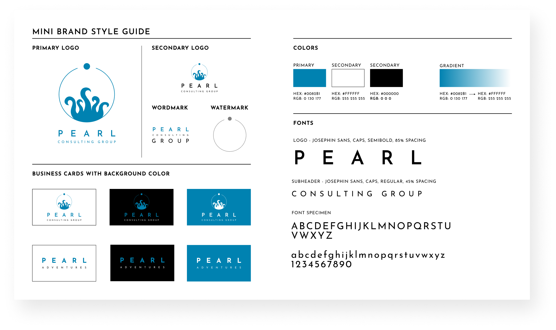
Client wanted a basic style guide to define brand attributes and to guide further development. I chose to include fonts, colors, and specific logo usages as well as a watermark for her powerpoint slides. Since the assets are pretty minimal currently, this can become more detailed as an eventual website’s needs dictate.
APPLICATIONS
LinkedIn home page logo usages
Venmo home
Business cards
NEXT STEPS:
Develop assets for eventual website and printed material as needed.
Track metrics to see if design changes drew more traffic to her LinkedIn profile
REFLECTION:
This was an overall fun project for me, as I love distilling a brand’s mood and emotions into a design. The most challenging part of this project was extracting enough critical information from the stakeholder in order to preliminarily define her vision, as well as calculating sizes for asset deliverables. A few rounds of targeted questions along with the Pinterest moodboarding exercise was really effective in helping the creative juices flow so that I could take it from there.
Questions that dealt with emotions such as “what kind of adjectives describe how you’d like your logo to make people feel?” and “what is the feel of your company?” were particularly effective.
This was a remote collaboration, taking place mostly over email/text/Zoom. Communicaton on project milestones was easy and efficient, but also flexible as the client has a full time job and family obligations.
I most enjoyed paying special attention to spacing and alignment, which gave me an opportunity to delve into how the Golden Ratio is utilized as part of good design practice and futher integrate that into my own toolkit.


