Vizible:
Dashboard creation, UI refresh, and information architecture revamp for a visually-based language analytics web platform start-up.
CLIENT
Vizible
ROLE
UX/UI Design, Data Visualization, Information Architecture
DURATION
1 Month
PROJECT YEAR
2022
TOOLS
Figma, Photoshop
DELIVERABLES
Site Map
Information Architecture
Concepting
Component Library Creation and Management
Dashboard Design
UI/Visual Design
User Experience Design
Data Visualization
Project Overview
Dashboard creation, UI refresh, and Information Architecture overhaul for Vizible, a metrics-based search engine start up that allows users to discover information and connections that traditional search engines discard. I worked remotely with a senior designer and stakeholders to deliver a fresh take on their product, distilling a complex idea into a user-friendly product.
This project included challenges such as working remotely with product owners over different time zones, creating a mini design system to unify overall look and feel, and updating existing pages to reflect changes to information architecture and new styles. These constraints required me to communicate effectively and ask detailed questions, as well as balance stakeholder requests with design best practices.
Challenge
Client approached me with the goal of re imagining the existing highly technical site experience to appeal to a broad audience. They needed fresh eyes on the project from a designer that wasn’t too close to the work and immersed in technical details. In order to streamline the experience, I had to first understand what they were trying to build and how it differentiated from other products on the market, which took some research and back and forth. Also, what had been designed and what had been built were very different from each other, so I had to make sure we were going to be able to pull in the appropriate talent when development time came around.
I communicated directly with the stakeholders in different time zones via email and zoom daily to check in on progress and update project needs, and iterated as necessary as approvals were given. Deliverables were needed asap when I was pulled in, so I had to work quickly and efficiently in order for the founders to make their funding round.
Solution
Perform usability audit, restructure information architecture and define site flows, create new landing page (Dashboard), create basic component library and edit existing UI for accessibility and responsiveness.
Benefits to be provided:
Effectiveness - semantic similarity (through ML and NLP) is a USP for communications and marketing and adds teeth to analysis
Visibility - daily news, stock correlation, competition, personalities, and critical connections in a single, living graphic
Espionage - pry into the best practices that are mastering any industry
Dashboard
BEFORE
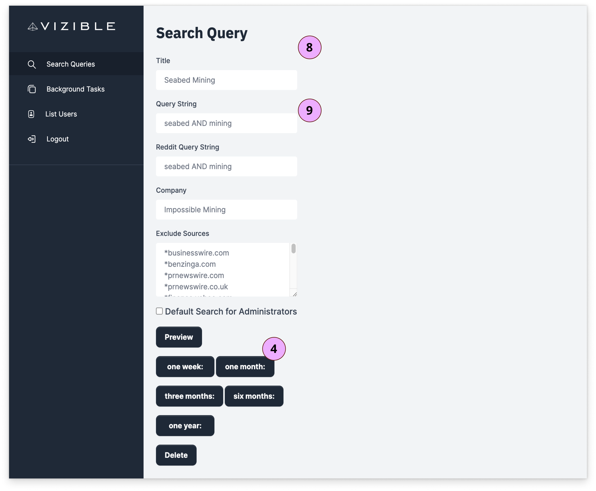
Initial layout and organization of landing page was confusing and a bit heavy handed.
AFTER
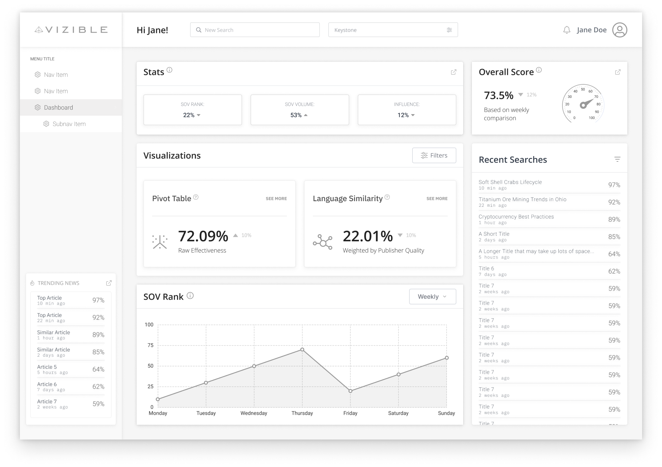
New landing page (dashboard) where a user can immediately see and modify all relevant information above the fold.
Process
Step 1: Empathize - Define Users
Types of users: Phase 1: Marketing professionals, CEOs, CFOs, stock market traders, cryptocurrency professionals
Phase 2: Public
Assumptions: Our clients want to see who is talking about them and in what ways, and need an all-in-one platform that lets them view that data and analytics, as well as search for related trends and competitors.
Pain Points: Current popular search engines leave a lot of information off the table that may be valuable to users in various fields, not just marketing.
Step 2: Define - General Usability Evaluation
Before making any changes or creating new pages in the existing prototype, I performed a basic UX Audit following Jakob Nielsen’s Usability Heuristics, in order to define what changes needed to be made, and in what order.
Issues were ranked from 1-4 in order of immediacy, 1= low priority to 4 = high priority. Showing a few standout screens with callouts, and the high priority items from the audit below.
LANDING PAGE
Navigation is confusing
UI styles inconsistent: spacing, buttons, color usage, etc.
No obvious site anchor point
Language is too complex
Navigation is confusing
UI styles inconsistent: spacing, buttons, color usage, etc.
SEARCH STATS/PIVOT WHEEL
Major site goal not clear and functions
related to it not easy to accessUI styles inconsistent: spacing, buttons, color usage, etc.
Icons meaning not clear
Back buttons needed
No loading states or messages
No user profile option
Accessibility needs to be checked
EDIT SEARCH
UI is heavy handed and spacing tight
Error states nonexistent
Button usage incorrect for sorting
Need states attached
Next Steps: (based on heuristic evaluation)
Research dashboards that include “search and compare”; Present findings to stakeholders
Define which other features belong on dashboard related to those primary functions
Sketch initial dashboard layout
Wireframe dashboard and iterate based on stakeholder feedback
Audit current pages to see how they fit into site flow or are redundant based on dashboard options, decide additional pages
Define IA (sitemap) to fix navigational issues, update side navigation bar
Perform UI Audit of current styles, make new mini design system that unifies them
Hi Fidelity mockups of new screens, apply new styles to existing screens
Documentation
HTML Development
Presentation to investors
Step 3: Dashboard Inspiration
In order to make decisions around Information Architecture and site flow reorganization, I wanted to first get a sense of how other technical dashboards were laid out, how they treated “Search” and “Compare”, and then take those examples to establish support with stakeholders about moving forward with an idea to prioritize those things. These examples were shown to stakeholders; the qualities they liked are listed next to each frame and were used to brainstorm potential features.
LIKES
floating stats and elevation of features
color contrast (dark blue nav bar)
Dial to show rank
bar graph layout
smaller line chart layout/modal
profile link small and at the top right
sizing and spacing of stat categories
search in top nav
Floating top bar stats visible on each page
easily compare stats side by side
nice elevation (drop shadows)
search in top nav
professional look - sizing of features and detailing
news feed displayed
line chart
radial graph
search in top nav
easily compare stats
Step 4: Ideate - Dashboard Sketches
Initial ideas for dashboard placement of stakeholder - proposed features:
3 stats floating modal at top (visible on each page, dismissable)
Profile link at top right (small)
Ability to search from dashboard
A way to set up Keystone
A way to set up Influence Score
Search history
Big number - total amount of articles
News feed underneath - articles with relevancy score at top, able to expand
“Welcome Back” or personal message
Current graphs too big
SOV rank - Line chart (moving) - able to sort by daily/weekly/monthly/etc.
Pivot Table
Language Similarity
Step 5: Dashboard Wireframes
In order to get a sense of site flow and IA, I wanted to firm up which features would be included on the dashboard. In conjunction with looking at the existing pages, I iterated on wireframes with stakeholder feedback until a good solution emerged. The final look revealed that some new pages needed to be created, the “Article Metrics” page, and the “All Articles” page. Graphs and data visualizations were re imagined as popouts from their respective places on the dashboard, and the Search, Keystone, Influence, and Players individual pages became slideout panels, simplifying navigation.
DASHBOARD ITERATIONS
V1: stats in top bar to save space, newsfeed in bottom left, and recent searches visible on right panel.
V2: Stats moved to own modal, Overall Score modal added as stakeholders wanted a place to show an overall ranking.
V3: Overall ranking becomes Effectiveness Score, a conglomeration of stats modal to the side. Pivot Table, Language Similarity, and Trending each get their own modal. Recent Searches becomes Newsfeed.
V4: Data visualizations added for stats at top, Share of Voice line chart shows multiple players rankings at once, and user is able to edit Search, Keystone, Influence, and Players directly from dashboard. Export function added on top nav.
Step 6: Information Architecture
After finalizing which features were to be included on the dashboard, it was time to look at the existing pages and see what could be deleted, combined, and which new pages needed to be created. I made a site flows using existing page views, then the sitemap. Navbar was adjusted accordingly when IA was set.
EXISTING SCREEN FLOWS
When mapped out, it’s easy to see how buried the main functions of the site are: modifying Search, Keystone, Players, and Influence. It’s also easy to pinpoint where and how the navigation menu completely changes, instead of simply expanding. I wanted to bring some unity and simplicity to the navigation process, as well as put the main functions front and center, so I drew a new sitemap based on the new dashboard wireframes.
EXISTING NAVIGATION
Nav bar contents completely change when "Searches” is selected instead of using dropdown categories, which is disorienting for the user.
Nav bar naming conventions change as well - ex. “Searches” also is called “Search Queries”; “Search Stats” also is called “Pivot Wheel”.
NEW NAVIGATION
New nav bar is pared down to distinct categories that a user or Admin may want to directly access, since most functions are directly reachable from dashboard modals. Profile viewing/editing is on top right, while “Search”, “Keystone”, Players” and “Influence” became dropdowns on main page. Dropdown categories have respective slide outs when editing and viewing history.
NEW SITEMAP - Consumer View
New sitemap shows simplified navigation - main features accessible from Dashboard modals, and data visualizations turn into popouts to enable a larger view. New pages created are marked with a red dot, and pages to be created in the future have a yellow dot.
Step 7: UI Audit
Before deciding on new styles to tie the UI experience together, I took an inventory of all the existing styles, fonts, and colors currently used on the site. I researched which fonts were best for data visualizations (Lato), and refined the current visualization primary color palette as inspiration that could be used across new elements as I created a responsive mini component library. S
Selected Examples:
CARDS
A container for a few short, related pieces of information; serves as an overview and entry point to more detailed information.
ICONS
Should be consistent in size, weight, placement, and clearly convey action to be performed.
Should be consistent in shape, color indicating primary v. secondary actions, clearly indicate via microcopy the specific function, and be placed near item of action.
BUTTONS
Step 8: High Fidelity
DASHBOARD
ARTICLE METRICS
SLIDEOUTS
POPOUTS
Re-designed Screens
OLD
NEW
OLD
NEW
OLD
NEW
Next Steps
Make prototype
Test prototype with users
Documentation for developers/HTML build
Present to potential investors
Refine as needed
Reflection:
I learned a lot about working within a lean UX process on this dashboard re-design, and while skipping user research is not ideal, learning how to work quickly with stakeholder’s interests and budgets in mind was a valuable experience. Being able to be flexible in my approach while advocating for best UX practices was in line with other professional experiences I’ve encountered when time and budgets are limited, or when only specific assets are requested.
Working remotely in different time zones was a good exercise in organization and communication, and articulating my ideas to senior leadership helped me get clear in my presentation style.
Going forward, I would like to advocate for user testing of the site once it’s live, and refine it with developers from there.


